
Case Study: How Studio Rancang Imaji Crafted Visual Communication for UNICEF’s Life Skills Program
The most basic question about craftsmanship is always: for whom did I create this piece of work? The answer depends on who you ask. For an artist, this question is almost unimportant, they simply create whatever they desire. But for us professional designers at Studio Rancang Imaji, based in Jakarta, it is the single most important question because it determines the final outcome and its actual real-world impact.
Before the work even begins, we love to ask our partners foundational questions: What is the primary purpose of your social campaign? What specific goals are you trying to achieve? Who is the main target audience? We search for very clear, granular details regarding who we are designing for. We want to give the absolute best to our partners, not merely in a flashy or superficial aesthetic way, but by delivering tangible results that help them reach their core business and social objectives. That is the core philosophy of Studio Rancang Imaji.
The Challenge: Reaching 69 Million Futures
UNICEF’s Life Skills Education program targets the world’s 1.2 billion adolescents. When a social campaign of this scale succeeds, it holds the potential to help break cycles of generational poverty. The program empowers young people with essential foundational skills,such as critical thinking, problem-solving, and emotional resilience, preparing them for higher education, job markets, and better livelihoods.
For our team at Studio Rancang Imaji, the core target audience was clear: Indonesian teenagers. They are the primary stakeholders of this initiative.
From a visual communication and UI/UX design perspective, the output of our work could not be just another generic institutional report. It had to be something that genuinely captured the interest of young people. Rather than focusing solely on flashy visual trends, we needed a design language that was approachable, intuitive, and deeply relatable to Indonesian youth across diverse backgrounds.
In social campaigns, visual design serves as the primary bridge between complex policy goals and human action. Our mandate was to translate UNICEF's extensive educational framework into digestible visual assets and user-friendly digital layouts.
Research & Segmentation: Designing Across the Digital Divide
Once we established who we were designing for, our next phase focused on channel-specific communication. How could the key messages of the Life Skills Program be delivered smoothly across diverse media, from social media posts and motion graphics to physical printed flyers and web user interfaces?
Target audiences are rarely homogenous. When analyzing the target demographic through socio-economic, geographic, and digital access lenses, distinct audience profiles emerge. We simplified our approach by categorizing design deliverables based on accessibility:
- Remote and Underdeveloped Regions (3T - Terluar, Tertinggal, Terpencil): Due to limited or absent internet connectivity, we prioritized high-impact print design assets. These included physical cards, infographics, and booklets designed with high contrast and legibility so they could be easily distributed in community centers and rural classrooms.
- Urban Adolescents: For urban youth with steady internet access, we designed dynamic digital assets, such as motion graphic video snippets, interactive social media graphics, and structured web layouts optimized for desktop and mobile screens.
Strategy: Bridging Communication Design and UI/UX Principles
To craft our assets, Studio Rancang Imaji applied foundational principles of visual communication alongside modern UI/UX design practices to ensure every touchpoint felt natural to the user:
- Clarity: Ensuring the core message—such as "What are Life Skills?"—is immediately understandable without cognitive overload.
- Visual Hierarchy: Guiding the reader’s eye naturally. On digital interfaces and motion graphic frames, key statements receive prominent typographical weight, followed by supporting explanations.
- Contrast: Using deliberate color palettes (such as high-contrast text against dark or vivid backgrounds) to highlight critical information like core skill categories.
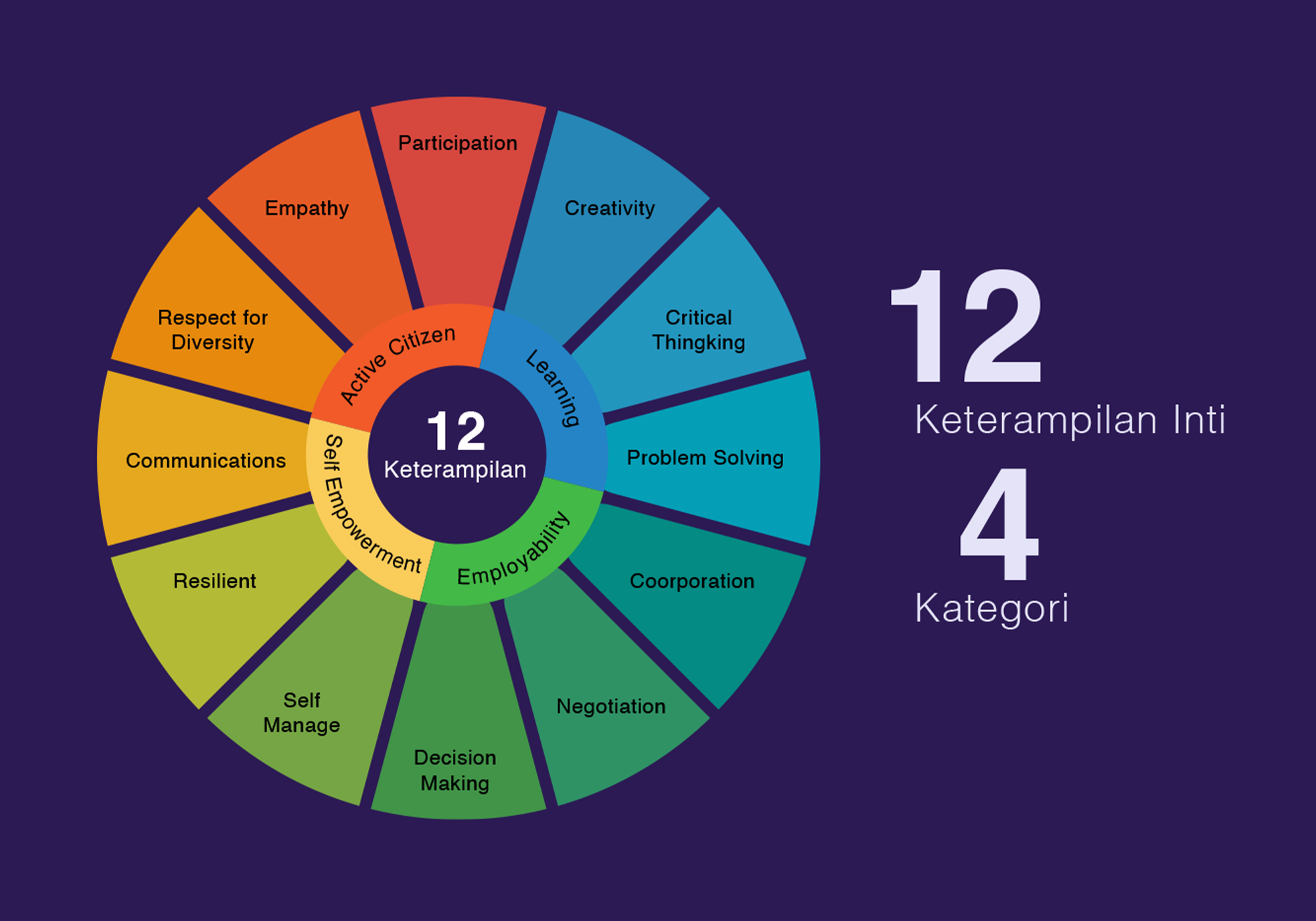
- Balance & Proximity: Grouping related concepts visually—such as organizing the 12 core life skills into four distinct functional quadrants—so complex educational models are easily digested at a glance.
- Consistency & System Design: Establishing unified iconography, typography, and color tokens across both print cards and digital video frames to build immediate brand recognition across channels.
- White Space / Negative Space: Allowing breathing room around UI components and printed text blocks to keep the layout from feeling overwhelming for young readers.
Good design must "talk" directly to its audience. When clear visual structure is paired with effective, empathetic copywriting, visual assets successfully deliver complex social messages directly to Indonesian teenagers.
Execution & Impact
The deliverables for the UNICEF Life Skills Social Campaign included a mix of print and digital media:
- Motion Graphic & Video Assets: Video overlays and YouTube-optimized layouts framed around clear, conversational questions (e.g., "Apakah Keterampilan Hidup?"). UI elements within video assets were simplified to maintain focus on the core messaging.
- Infographic Frameworks: Conceptual wheels dividing the 12 core skills (e.g., Critical Thinking, Creativity, Empathy, Resilience) into four digestible categories (Learning, Employability, Personal Empowerment, Active Citizenship), making abstract educational theories instantly understandable.
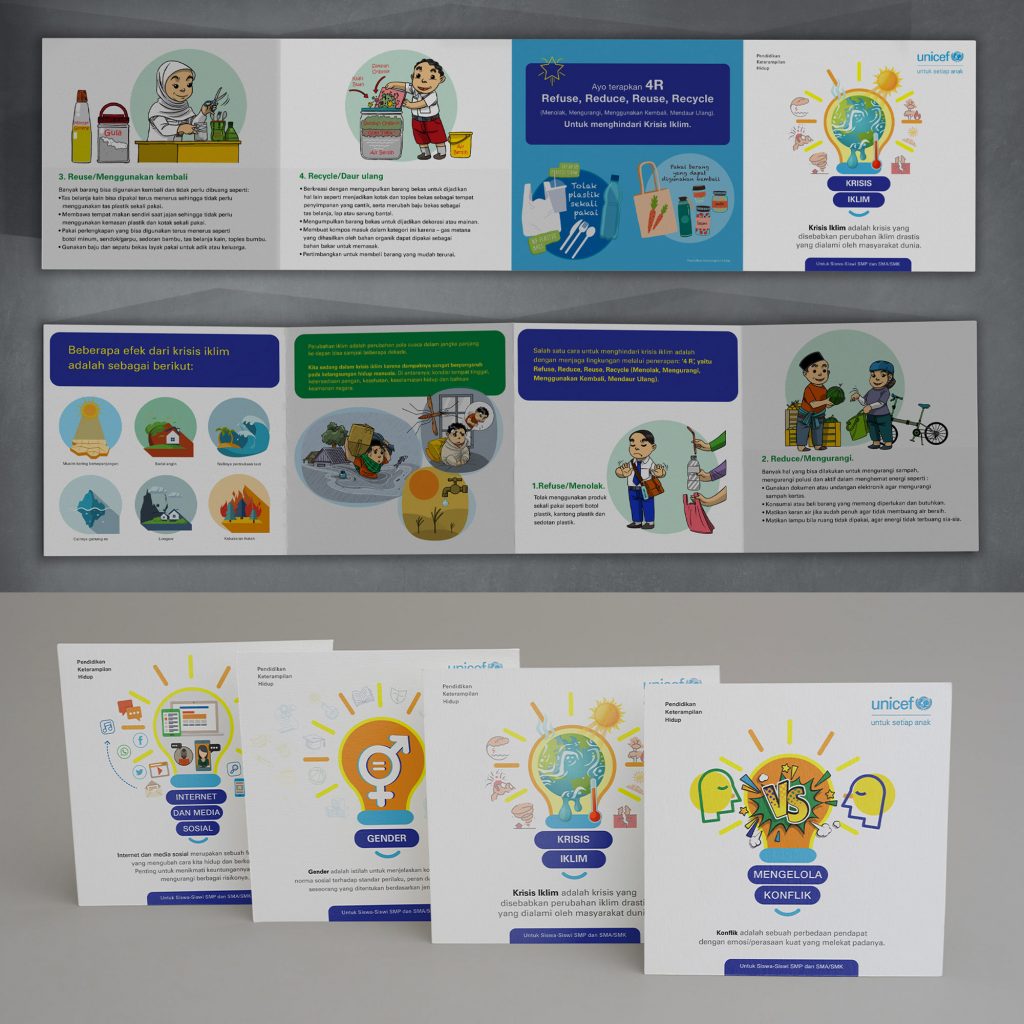
- Print & Social Campaign Cards: Clean, square-format cards covering urgent topics like the climate crisis (Krisis Iklim), structured specifically for junior high (SMP) and senior high (SMA/SMK) students using accessible language and supportive visual metaphors.
By grounding our visual communication design in audience research and clear UI/UX hierarchy, Studio Rancang Imaji helped UNICEF Indonesia transform an extensive global initiative into an engaging, accessible educational campaign.
Explore our full case study and complete visual portfolio on the Studio Rancang Imaji by clicking the button below