
Studty Case: How to Introduce Solar Powered Electricity in to Remote Part's of Sumba
It’s not every day you get a brief that literally lights up a village. But for us at Studio Rancang Imaji, that’s exactly what landed on our desks—a request from Castle Rock to help design a safety campaign for a solar power plant (PLTS) project in the isolated hinterlands of Sumba Island, Indonesia.
This wasn’t just another infrastructure project. This was a "you scratch my back, I’ll light your house" kind of deal. Five remote villages were asked to donate a portion of their land for a massive PLTS installation. In exchange, these villages—which had likely spent generations squinting in the dark—would finally receive a steady, reliable supply of electricity. It’s beautiful, it’s community-driven, and it’s incredibly practical.
But here’s the kicker: how do you explain the dangers of high-voltage electricity to people who have never even seen a proper light switch?
That was our puzzle. And we were determined to solve it—one poster, flyer, and safety symbol at a time.
The Process: Designing for Memory, Not Just the Eyes
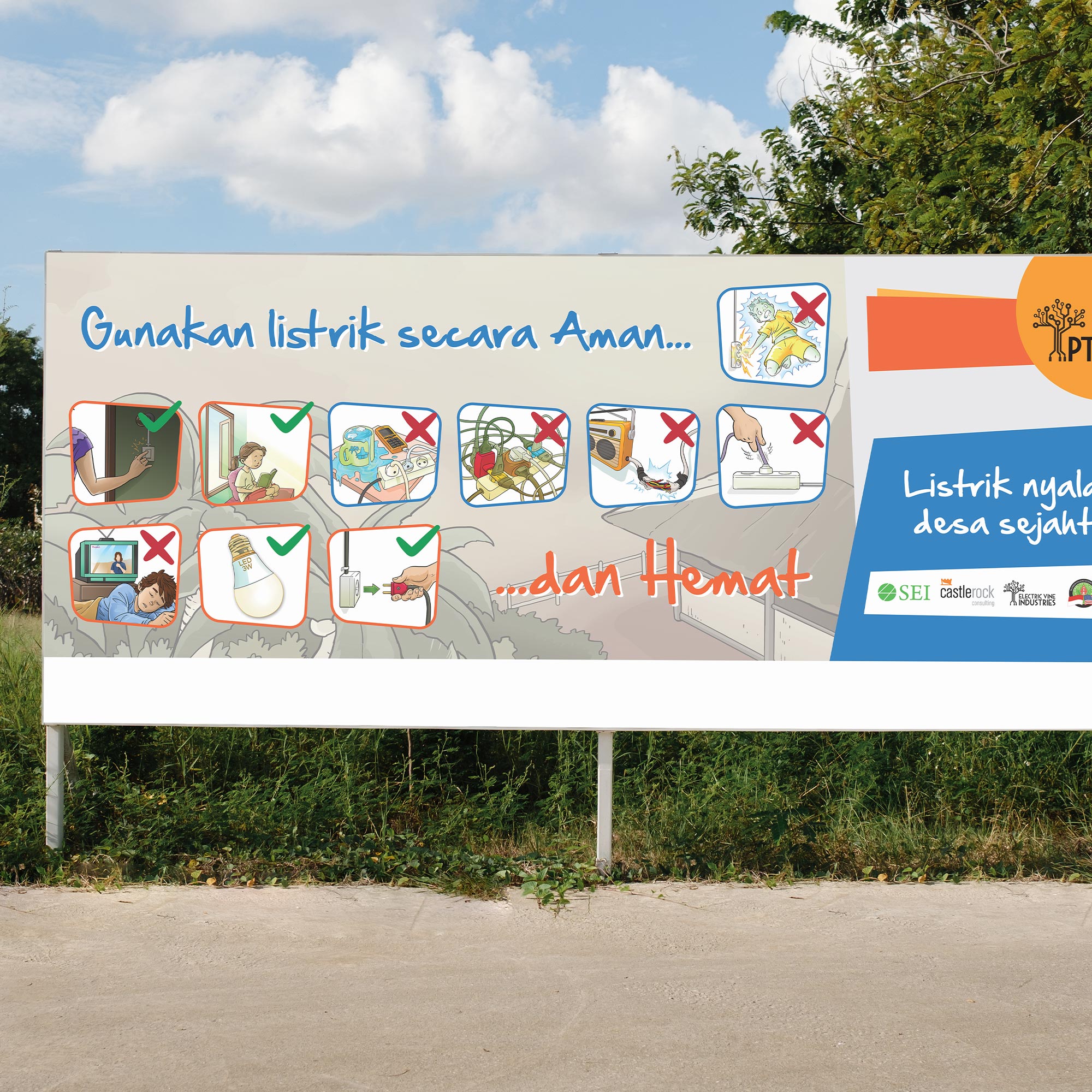
Now, let’s talk about the visuals. You’d think creating a poster is easy. Slap a "DANGER" sign, add a skull, and you’re done. But in a community where exposure to Western signage is minimal, the "skull and crossbones" might just look like a pirate logo. We had to build a visual language from scratch—one that spoke louder than words.
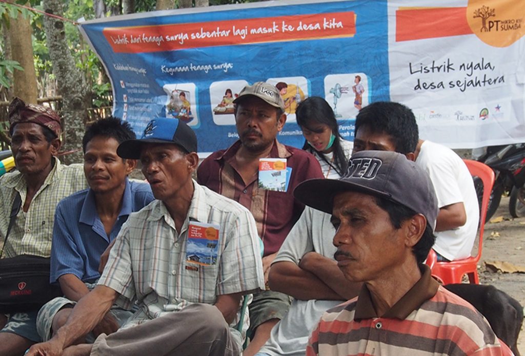
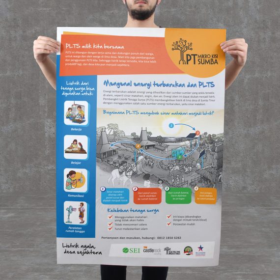
We realized early on that these visual assets (posters, flyers, banners) were not just decorative. They were memory anchors. They were designed to support community outreach sessions and make sure that the lessons stuck long after the social workers had gone home.
Consider the scale of the PLTS project. This wasn't a small solar panel for a single home. This was a kecamatan-sized power plant, generating enough juice to light up an entire subdistrict. The equipment—batteries, high-voltage cables, towering poles—was dangerous. One wrong move, one curious child tugging at a wire, one oblivious goat rubbing against a terminal, and you’ve got a disaster.
So, we created visual reminders that were loud, clear, and practically unmissable. We designed flyers that could be pinned inside homes and banners for the village halls. The goal was constant, passive exposure—like those earworm jingles you can’t get out of your head, but for safety.
We also made sure to illustrate simple rules:
- "Jangan memanjat tiang listrik." (Don't climb the electric poles.) Because, well, it’s a surprisingly common pastime in places where trees are the main climbing structures.
- "Jangan mendekati area kerja." (Don't go near the work area.) This meant keeping kids and wandering livestock away from construction zones.
- "Hati-hati kendaraan proyek." (Watch out for project vehicles.) Because nobody wants to explain to a village chief why a dump truck had a close encounter with a cow.
We used bold, fiery reds and yellows—colours that trigger an immediate psychological "stop" response, even if you’re not entirely sure what the text says. For the children, we used clear illustrations that crossed linguistic barriers. A picture of a kid falling from a pole doesn't need translation; the message is universally understood: Don't do that.
The Design Theory: Offline UX for the Uninitiated
Now, let’s bring this back to our wheelhouse: visual design and its cousin, UI/UX. Most people think UI/UX is just about apps and websites. But good UX is about human behaviour. It’s about guiding people through an experience with as little friction as possible.
In this case, the "user" was the Sumbanese villager, and the "interface" was the dusty road and the brand-new, shiny, life-threatening PLTS installation.
We approached this like a UX problem:
- User Persona: A farmer with basic literacy, reliant on oral tradition, with a deep respect for visual storytelling (often influenced by local art and crafts).
- Pain Points: Death by electrocution. Destroying expensive equipment. Burning down the rice fields.
- The Solution (Our Design): Create a mental "anti-virus" for the brain. Whenever a villager sees a yellow sticker with a lightning bolt, they instinctively think, "Ah, that's the thing I should not touch."
We applied the KISS principle (Keep It Simple, Stupid) with religious fervour. We repeated core safety messages across multiple formats—posters, banners, flyers—because in UI/UX, repetition is the mother of retention. It’s the same reason Facebook changes your notifications to red when you have an alert: it’s designed to be processed instantly, without conscious effort.
The Social Campaign: A Shared Responsibility
The end goal of this campaign was never just about "selling" the PLTS to the village. It was about fostering a sense of communal ownership. As we wrote in our initial research, "Keamanan penggunaan PLTS adalah tanggung jawab kita semua" (The safety of the PLTS is the responsibility of us all).
This was a key psychological touchpoint. By framing safety as a collective duty—not just a rule imposed by a faceless corporation in Jakarta—we gave the villagers a stake in the project’s success.
We designed social campaign materials that shouted "Together" rather than "Obey." We listed positive outcomes ("Listrik nyala, desa sejahtera"—Electricity is on, the village is prosperous) alongside the negative consequences ("Jangan menangkap pokok di sekitar tiang"—Don't touch the poles).
We also made sure these materials were hardy. Sumba is dusty, rainy, and windy. We had to imagine our designs being nailed to wooden posts, faded by the sun, and still readable two years later. We used high-contrast visuals because, let’s be honest, nobody is checking their contrast ratios when they're just trying to avoid a fatal shock.
The Impact: Illuminating Minds, One Poster at a Time
So, did it work?
Well, the PLTS is now humming, supplying electricity to five villages. And while we can’t take full credit for the engineering, we like to think our humble visuals played a part in ensuring that nobody got hurt during the transition.
The campaign achieved its "end goal": supporting social outreach and occupational health and safety (K3S). The flyers became conversation starters in village halls. The children, who are always the most effective little educators, began pointing at the signs and shouting "Awas!" (Watch out!) at their parents.
We at Studio Rancang Imaji believe that design is a communication cheat code but only when it’s stripped of ego and tailored to its audience. We didn't design for awards; we designed for a 60-year-old farmer who needs to know why he shouldn't use the electrical pole as a scratching post for his cattle.
In the end, our designs did more than just decorate the village. They translated complex, life-or-death information into a universal visual language. They turned a dangerous utility into a cherished community asset.
Because when you're in the middle of nowhere, and the lights are on, and everyone is safe... that's the best UX you can ask for.
Listrik nyala, desa sejahtera.
When Electricity is on the village will prosperous
Visit our Castle Rock Portfolio Pages to see our works: