
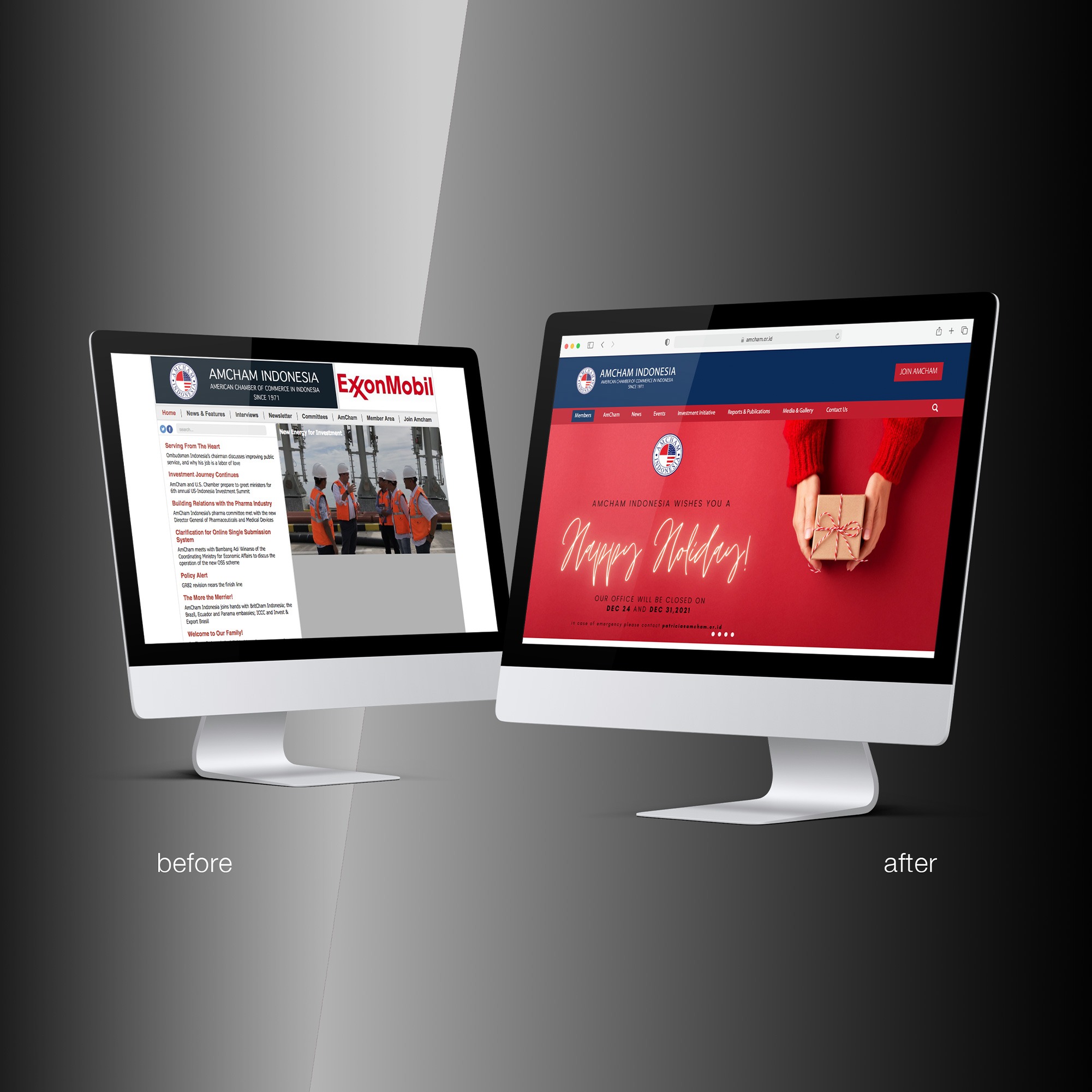
Revamping Website UI/UX AmCham Indonesia’s Digital Experience
At Studio Rancang Imaji, we like to think of design a little like coffee: there is always a right proportion.
Too much, and it becomes overwhelming. Too little, and the result feels flat. The same principle applies to digital design. A website can have beautiful visuals, sophisticated interactions, and an impressive amount of information but if users cannot understand where to go next, the design is not doing its job.
For us, UI/UX design is ultimately about creating a digital experience that helps people accomplish something.
This philosophy guided our UI/UX revamp project for the American Chamber of Commerce in Indonesia (AmCham Indonesia). The objective was not simply to make the website look newer. It was to transform the website into a more effective communication and business platform, one that could help users find information more easily while also encouraging them to take the next step, whether that meant learning more about AmCham Indonesia's services, engaging with the organization, or becoming a member.
The Challenge: When Information Becomes the Problem
Once the objectives were established, our first step was not opening Figma.
It was identifying the problems.
As organizations grow, their websites tend to grow with them. New information is added, new programs appear, new services are introduced, and new audiences arrive. Eventually, a website can become something resembling a very well-organized storage room: everything is technically there, but finding the thing you need requires a little archaeology.
That was one of the challenges facing AmCham Indonesia.
The existing interface had begun to feel dated, while the amount of information available on the website continued to increase. As a result, users could have difficulty finding relevant content or understanding where they should go next.
There was also a business challenge.
The website needed to do more than provide information. It needed to function as a conversion-oriented platform, helping turn visitors into engaged users and, ultimately, potential customers, partners, or members.
This meant reconsidering both User Interface and User Experience.
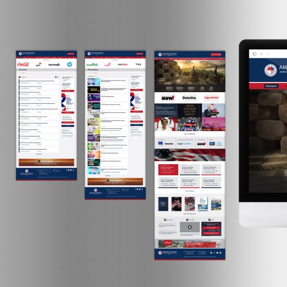
The interface needed a stronger visual hierarchy. The information architecture needed to become more structured. And the user journey needed to feel more intuitive, so that users were not simply reading information but being guided toward meaningful actions.
Designing Around the User
Before we started the redesign, we returned to several fundamental principles of UI/UX design.
User-Centricity
Every design decision should begin with the user's needs, goals, and pain points.
For AmCham Indonesia, this meant asking a simple question repeatedly:
What is the user actually trying to find or accomplish here?
Visual Hierarchy
Not every piece of information has equal importance.
Through typography, scale, spacing, positioning, and other visual cues, we created a hierarchy that allows users to understand what matters first, what matters next, and where they can continue.
Consistency
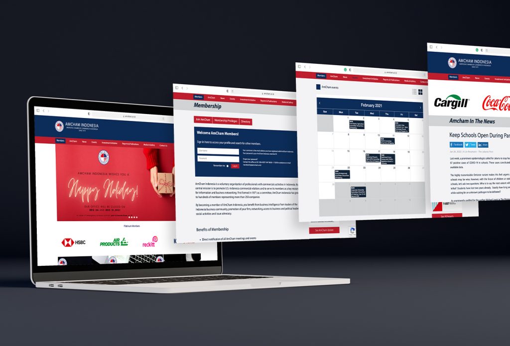
Buttons should behave like buttons. Navigation should behave like navigation. Components should look and function consistently.
Consistency reduces the amount of mental processing required from users. They should not have to learn a new interface every time they move to another section of the website.
Simplicity and Clarity
More information does not necessarily mean more value.
Sometimes, the best design decision is to remove something, shorten something, or divide something into smaller pieces. Our objective was to reduce unnecessary cognitive effort and make information easier to consume.
Feedback and User Control
Digital experiences need to communicate what is happening.
Whether a user is submitting a form, navigating between sections, or completing an action, the interface should provide appropriate feedback and allow users to understand what happened next.
Accessibility
A good digital experience should not be designed only for the ideal user sitting in front of a large monitor with perfect eyesight and unlimited patience.
Accessibility considerations help ensure that the experience remains usable across different users, devices, and circumstances.
These principles became the foundation of our approach before we began the visual redesign.
From Information Overload to Easy to Digest
Once we understood the challenges, we approached the redesign through a combination of UI design, UX principles, information architecture, and behavioral design.
One of the first principles we considered was the Paradox of Choice.
When users are presented with too many choices at once, decision-making can become more difficult. In a business context, this matters because hesitation can become friction—and friction can eventually become abandonment.
So rather than presenting everything simultaneously, we worked toward creating clearer pathways through the website.
We also considered Cognitive Load.
Information was divided into smaller, more digestible chunks, allowing users to process one idea at a time rather than confronting large blocks of information. This approach is particularly important for an organization such as AmCham Indonesia, where the website needs to communicate a significant amount of business, membership, event, and organizational information.
The challenge was not simply to reduce information.
It was to organize information so that it felt lighter.
Making the Familiar Feel Intuitive
Another principle we applied was the Law of Common Region.
By visually grouping related elements, we created clearer relationships between pieces of information. Sections that belonged together were designed to feel like a single unit, helping users understand the structure of a page without requiring explicit explanation.
We also applied Jakob's Law, which suggests that users expect a website to behave similarly to other websites they already know.
This may sound slightly counterintuitive for a design studio. After all, designers are often encouraged to create something unique.
But uniqueness is not always usability.
If users already understand how modern websites work, there is little benefit in making them relearn basic navigation simply because we want the interface to look different.
For the AmCham Indonesia website, familiarity became an advantage. We could introduce a refreshed visual identity while maintaining interaction patterns that users already understood.
Then there was Hick's Law: the more choices a person has, the longer it generally takes to make a decision.
For a business-oriented website, this can have direct consequences.
If a visitor is interested in membership, for example, we do not want the interface to make them wonder where to click, which section contains the relevant information, or what they are supposed to do next.
The goal was therefore to make important pathways straightforward and intentional.
UI/UX as a Business Tool
This is where UI/UX design becomes more than an exercise in aesthetics.
A website is often one of the first points of contact between an organization and its audience. Before speaking with a representative, attending an event, or becoming a member, a potential user may first encounter the organization through its website.
That means the website is already part of the organization's communication strategy.
For AmCham Indonesia, the redesign was therefore about aligning communication objectives with user behavior.
The interface needed to communicate credibility.
The information architecture needed to communicate structure.
The user journey needed to communicate direction.
And the conversion points needed to communicate opportunity.
In other words, we were not simply asking:
"How can we make this website look better?"
We were asking:
"How can the website help AmCham Indonesia achieve what the organization needs it to achieve?"
That distinction shaped the entire project.
The Result: A Website With a Clearer Purpose
The result was a more structured digital experience designed around clearer information pathways and more purposeful user journeys.
Instead of treating the website as a collection of pages, we approached it as an interconnected communication system. Each section has a role, each visual hierarchy has a purpose, and each interaction is designed to help the user move forward.
For us at Studio Rancang Imaji, this is the real value of UI/UX design.
A successful redesign does not necessarily announce itself.
Users should not have to think about the navigation system. They should simply find what they need. They should understand what they are looking at. And when they are ready to take action, the interface should make that action feel natural.
That is ultimately what we wanted to achieve with the AmCham Indonesia website: a digital platform that communicates more clearly, guides users more effectively, and creates a stronger connection between the organization's objectives and the user's needs.
Good design, after all, is not about adding more.
It is about finding the right amount.
Just like coffee.
Too much and you cannot taste anything else. Too little and you wonder where the coffee went.
The right balance lets the experience do its job.
Explore the AmCham Indonesia website: amcham.or.id
More visual assets and selected work by Studio Rancang Imaji: