
KPAN: Addressing HIV/AIDS in Remote Work Areas With Communication Visual Design
HIV/AIDS is a public health issue that does not stop at the city limits. In Indonesia, the risk of transmission can become particularly difficult to address in remote working environments such as plantations, mining sites, and industrial areas, places where workers may live far from their families and where access to health information and services can be limited.
HIV can be transmitted through certain bodily fluids, including through unsafe sexual activity and the sharing of contaminated needles. Without sufficient awareness, risky behavior can increase the possibility of transmission, not only among those directly exposed, but also to their partners and families.
For the Komisi Penanggulangan AIDS Nasional (KPAN), Indonesia's National AIDS Commission, the challenge was straightforward to describe but much harder to solve: how do you communicate the risks of HIV/AIDS to workers in remote areas in a way that actually gets their attention?
This became the starting point for a communication campaign developed with Studio Rancang Imaji, a Jakarta-based design studio focused on using visual communication to turn complex messages into something people can understand, remember, and most importantly, act upon.
Visual That Impacted
A social campaign is not simply a matter of putting information on a poster and hoping someone reads it.
When communicating a sensitive subject such as HIV/AIDS, several elements determine whether a message will actually work:
- A clear message
- A clearly defined audience
- A credible messenger
- An emotional response
The core message of the campaign was relatively simple: HIV/AIDS carries serious consequences, and people can take practical steps to reduce their risk.
The audience, meanwhile, was very specific. The campaign targeted workers in remote locations, particularly those working in plantations, mining, and other industrial sites.
From our experience and field understanding, remote work sites can create social environments that differ significantly from those in urban areas. Workers may spend extended periods away from their partners and families. In some locations, commercial sex can emerge around newly established industrial sites. It is an uncomfortable reality, but effective communication sometimes requires us to start with reality rather than pretend it does not exist.
That made the communication challenge even more important.
The messenger was also clearly established. KPAN was the national authority responsible for HIV/AIDS prevention, giving the campaign an important foundation of credibility. When the subject is as sensitive as sexual health, people need to know that the information is coming from somewhere they can trust.
Then came the most delicate part: emotion.
We wanted the audience to feel a sense of alertness but not fear for the sake of fear. The intention was to create awareness that would lead to responsible behavior.
Many sexually active men may not immediately consider themselves at risk and may even be reluctant to undergo HIV testing. Therefore, simply presenting statistics was unlikely to be enough. The campaign needed to make the issue feel personal.
The Strategy
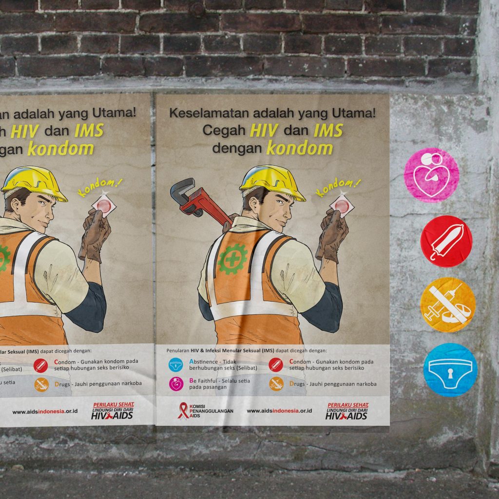
Our first challenge was finding a visual language that could speak directly to the workers we were targeting.
Rather than using overly polished stock photography or generic health illustrations, we chose illustration as the primary visual language.
The visual style was deliberately built around representations of working-class characters. There is a long history of illustration being used to represent workers, labor movements, public information, and social campaigns across different parts of the world. We saw an opportunity to use that visual heritage to create something that felt familiar to the intended audience.
In other words, we did not want to show workers as an abstract demographic in a marketing presentation. We wanted them to see themselves.
The characters became the entry point.
Once the audience's attention was captured, the supporting information could do its job: explaining the risks of unsafe sex, HIV/AIDS transmission, and practical ways to reduce those risks.
One of the key messages was the use of condoms as a practical prevention measure. Rather than presenting prevention as an abstract medical concept, we positioned the condom as a straightforward, tangible solution.
This was an important communication decision.
When designing social campaigns, particularly campaigns involving behavior change, information needs to move beyond "Here is the problem" toward "Here is what you can do about it."
That difference may seem small, but from a communication design perspective, it is significant.
The Execution
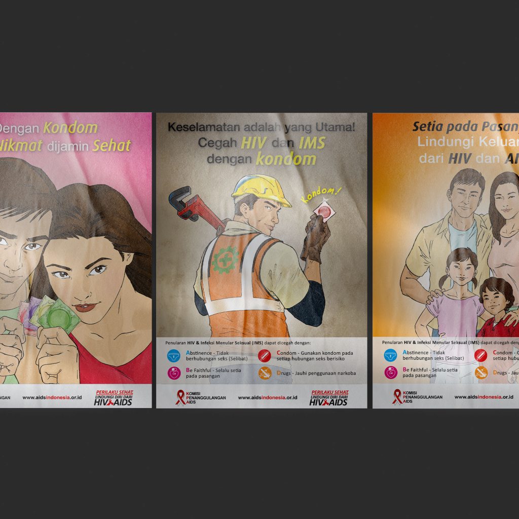
The campaign was developed as a visual communication system rather than a single poster.
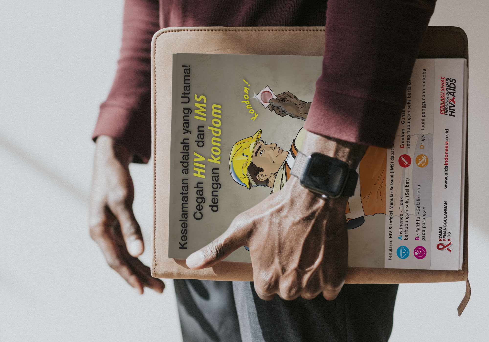
We created a range of assets that could operate across different touchpoints: educational flyers, posters, workplace materials, promotional objects, and other campaign collateral.
The campaign's visual identity was carried consistently across these materials. The recurring characters, colors, symbols, typography, and prevention messages helped establish recognition.
One of the strongest elements was the use of simple visual symbols to communicate the four key behavioral messages: abstinence, being faithful to one's partner, condom use, and avoiding drugs.
This is where visual communication design becomes particularly useful.
A long paragraph explaining four prevention strategies requires attention and reading. A recognizable icon can communicate the category of a message almost instantly. The icon then becomes a visual anchor that helps the reader navigate the supporting information.
The campaign was also designed to live beyond the page.
Posters could be placed in workplaces. Flyers could be distributed directly to workers. The visual language could be adapted into merchandise such as mugs, keychains, and other everyday objects.
The intention was simple: make the message difficult to forget.
If the campaign only existed for the few seconds it took someone to read a poster, its impact would be limited. By extending the visual system into objects that people could encounter repeatedly, the campaign could become part of the audience's everyday environment.
A mug on a desk. A keychain in a pocket. A flyer carried home.
Suddenly, a health campaign is no longer confined to the wall where the poster was originally placed.
Communication Design as a Behavioral Tool
For us at Studio Rancang Imaji, this project demonstrated an important principle of communication design: good design is not decoration added after the message has been written.
Design is part of how the message itself is constructed.
The illustration establishes identification.
The typography establishes hierarchy.
The icons simplify information.
The color system creates recognition.
The physical applications create repeated exposure.
Together, these elements form a communication experience.
There is also a useful connection here to the principles we see today in UI/UX design.
A well-designed interface asks: What does the user need to understand, and what should they do next?
A social campaign faces essentially the same question.
The audience needs to understand the risk. Then they need to understand the available preventive action. The information must be easy to scan, the hierarchy must be obvious, and the desired behavior must be clear.
The difference is that instead of a button saying "Learn More" or "Get Started," the call to action might be much more consequential: use protection, avoid risky behavior, get tested, and protect your partner.
In that sense, designing a public health campaign is also a form of experience design. We are designing the journey from seeing → understanding → remembering → acting.
And unlike a website, there is no analytics dashboard telling us whether someone actually paid attention.
The poster has to do the hard work.
Designing for Impact
The ultimate objective of the KPAN campaign was never simply to produce attractive printed materials.
The objective was to increase awareness and encourage safer behavior among workers who might otherwise have limited exposure to HIV/AIDS information.
For Studio Rancang Imaji, the project was an opportunity to demonstrate how visual communication can operate as a practical tool for social change. By understanding the audience first, selecting a visual language that could speak to them, and building a consistent system across multiple media, we helped transform a complex and sensitive public health issue into something more approachable and memorable.
Because in social campaigns, being seen is only the first step.
The real measure of communication is what happens after someone looks away.
Do they remember the message?
Do they understand the risk?
Do they talk about it with their partner?
And, ultimately, does the message influence what they do?
That is where communication design becomes more than visual design.
It becomes a bridge between information and behavior.
And sometimes, the most successful campaign is not the one people remember as a beautiful poster—but the one they remember at exactly the moment they need to make a better decision.
Studio Rancang Imaji is a Jakarta-based design studio with extensive experience developing visual communication solutions for brands, institutions, and social initiatives. Through strategy, graphic design, illustration, digital media, motion, and physical applications, we help turn complex objectives into communication that people can actually understand and engage with.
Please click the button below to visit our portfolio page of KPAN.